LOGOTYPE 101:
Types
of Logo & Their Relative Merits Where
to Begin?
How
Long Does it Take? Additional
Things to Consider Cost
TYPES
OF LOGOS & THEIR RELATIVE MERITS
Logo in Greek means word. While some
logos are indeed based solely on the name of a company, the
term has come to have a much broader meaning. There are perhaps
seven or more different kinds of logo and some hybrids. The
first thing I do with a new client is explain this
and compare it to their needs in order to define
the field of exploration.
- As soon as a company decides that whenever
its name appears it will be in the same font, it is the beginning
of a consistent identification. An example of this would be
J.C. Penny.
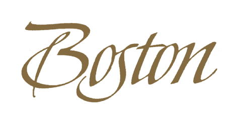
- The name in an individualized style.
e.g., Boston Pianos (Steinway)
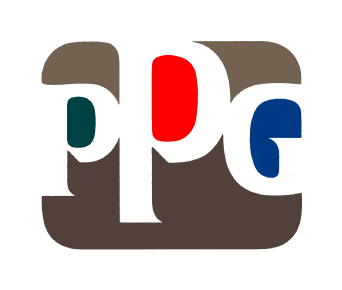
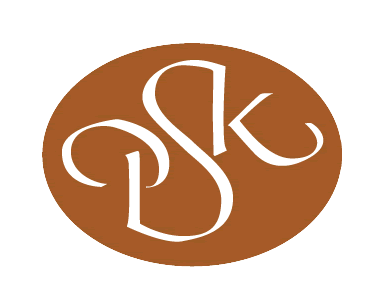
- Initials such as PPG or
a monogram, e.g., PSK (Pagano
Schenk & Kay.) There are probably far too many initials
out there to make that an appealing choice.
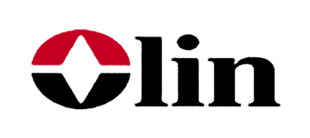
- The initial letter emphasized and made
unique - Olin Matheson Chemical Company, which L&M improved
by shortening to Olin.
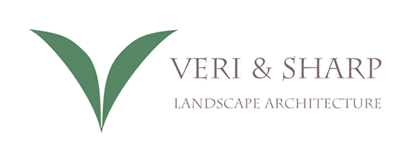
- The initial abstracted and perhaps semi-legible.
This now requires the name of the company appended to it, the
first two-piece identifier, sometimes disadvantageous in tight
spaces. Examples: Veri & Sharp and Angela Moore.
- An abstract, or better, non-objective mark
such as Nike (which I didn't design). Takes a lot of advertising
but wonderfully effective when established. Only then can it
be used without the name of the company.
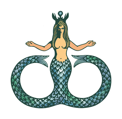
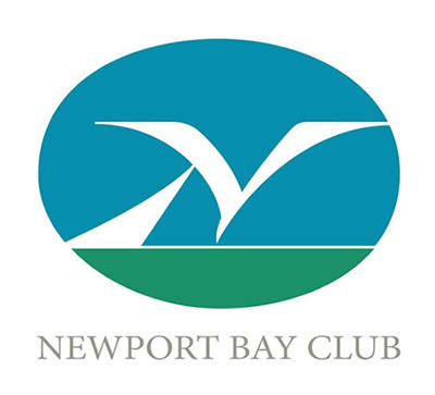
- A pictorial mark like the mermaid I
did for Clarke Cooke House, Newport. A hybrid might be a letter
that also looks like a thing; a sort of visual pun as in the
Newport Bay Club abstracted seagull and sail.
Each of these approaches has advantages and
disadvantages. The name alone is immediate and unequivocal - good
for new ventures but not really practical if the name is too long.
The abstract mark, bold as a flag, easily reduces to small sizes,
but takes time to establish. The pictorial mark, perhaps atmospheric
and nostalgic, may not reduce well if too intricate. The strongly
designed initial is removable for solo use or may be combined with
the name, and so on.
Understanding these differences and the unique
qualities of a company that distinguish it in the marketplace form
the foundation of successful logo design.
WHERE
TO BEGIN?
Choosing a logotype for your company can
be difficult but choosing a designer should be simple. Go for
experience. Let me see if I can help by setting
out some design criteria.
What you want a logo to
do for you can vary widely from one business to another. One
may have to compete on the crowded shelves of a supermarket.
Another will be used only on stationery. Regardless, some qualities
are consistent:
- a logo should be unique
- it should convey some feeling of the style
or substance of your trade
- it should be capable of application to the
media you most use
- it should be instantly recognizable as yours
HOW LONG
DOES IT TAKE?
To create such a visual epigram is not
easy. Ideally if time and budget allow, a logo should be done
on a no-stone-unturned basis. You don't want to look at it 5
years down the road and realize that it looks dated or inappropriate.
Implementing a new one can be costly - discarding stationery,
let alone repainting a fleet of trucks or changing signage. So
you want to look at a great many designs before making a choice.
ADDITIONAL THINGS
TO CONSIDER
Some logos only become truly effective after
long usage. Example: an abstract mark like a red triangle (Citgo,
Bass Ale) means nothing on the day it was first drawn, but becomes
immensely valuable years later.
It is possible for a logo that consists of no
more than the name of a company in a distinctive font to communicate
something about a company. It is also true that a more descriptive
device, when used with careful and consistent typography, can be
effective. But even a good logo carelessly used with regard to
size, color, placement, or a distracting background, can be ineffective.
COST
It's very difficult to price a logo design
project. No two clients reach a decision with the same alacrity.
Moreover, logo problems vary enormously in degree of difficulty.
What the traffic will bear should not be a factor, but some weight
must be given to the size of the company to be served. The decision-making
process can be protracted or even founder entirely. It may
be because the design output is inadequate to the task, or
because of the client's simple inability to make a choice.
Since most
of the labor occurs at the beginning of a project, involving
production of a great many roughs, the designer must be protected
by having received part of the total fee as a retainer. After seeing
the initial output, should the client decide to break off and seek
help elsewhere, only the retainer will have been expended.
If the last seems a bit ominous, be assured that
working with a designer who has a long proven track record will
more than likely produce a result that satisfies both parties. |